Updated: 2026-05-29 10:145:00
Introduction to HTML and CSS
Table of contents
A code example accompanying this notebook is available on the
fswd-apprepository.First,
git clonethe repository.Next, run
git switch html+cssto switch to thehtml+cssbranch of the repository.The package includes the two toy examples from the CSS section of this notebook, plus the full FAQ web page example.
To visit these pages,
flask runthe web app. Then, visit in turn:
Learning objectives
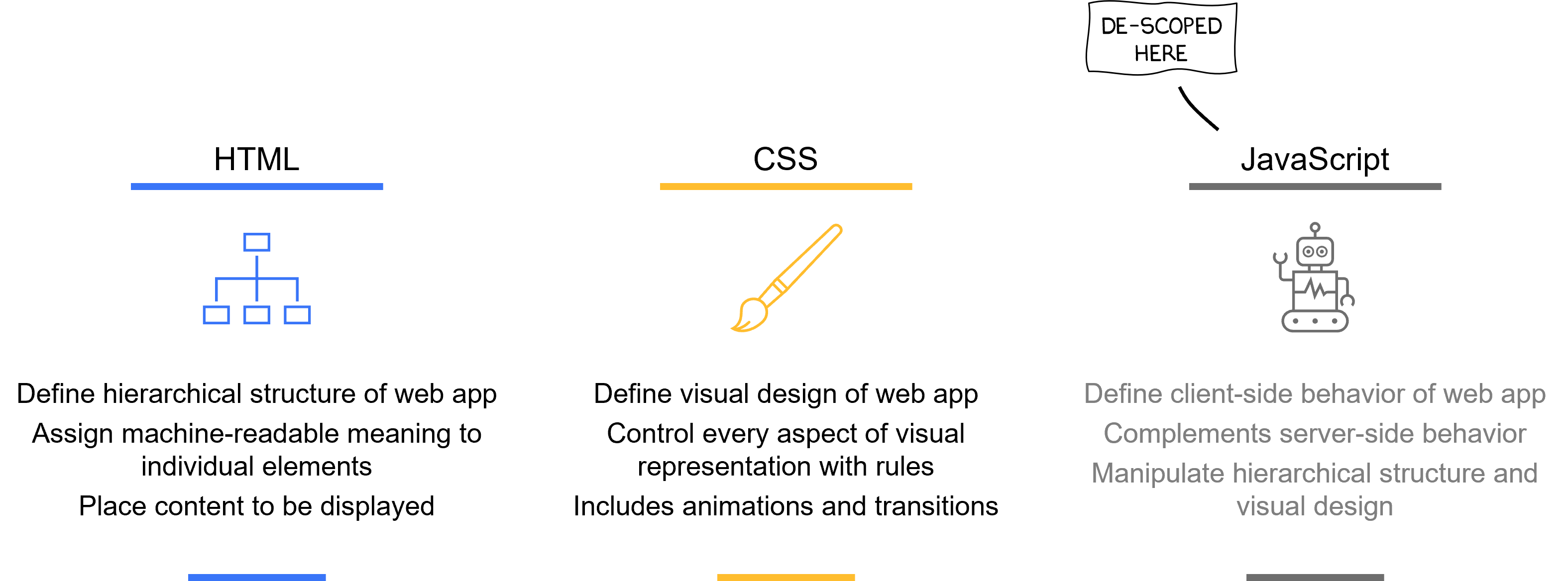
At the end of this notebook, you will understand the fundamental concepts of the two essential client technologies in web app development, namely Hypertext Markup Language (HTML) and Cascading Style Sheets (CSS):
- HTML lets you define the structure (and content) of your web application’s user interface.
- CSS lets you define the visual design of your user interface.
JavaScript typically gets mentioned on the list of essential client technologies as well: all modern web browsers interpret this programming language, which makes JavaScript the predominant technology to define the client-side behavior of your web application.
However, we purposely de-scoped JavaScript for four main reasons:
- First, this course already covers many technologies like Python, the Flask framework, etc.
- Second, the HTML standard has expanded to encompass such nice things like form validation and data exchange.
- Third, advanced use of CSS lets you react on common user interactions such as a mouse click, which may replace the use of JavaScript for specific use cases.
- Fourth, it is viable to develop a modern web application with little or even no use of JavaScript.
- Fifth, with abstractions like htmx you can leverage JavaScript for common use-cases while remaining in the HTML paradigm.
HTML: define structure (and content); CSS: define visual design
1. Prerequisites
This notebook does not contain a single line of Python code, nor does it invoke the Jinja2 templating engine to deliver HTML pages. We will focus purely on HTML and CSS, which is already a lot of ground to cover for a single session.
Having said that, we follow the convention laid our before in our Flask-based notebooks:
- HTML pages are located in the project sub-folder
📁templates/ - CSS files are located in the project sub-folder
📁static/css/ - Image files are located in the project sub-folder
📁static/images/
2. HTML
HTML is the standard way to structure a web-accessible resource meant to be consumed by a person (aka a web page): a web browser takes a HTML file, which describes the structure (and the content) of a web page, and renders it (i.e., turn the HTML file into a visual representation).
The dominance of JavaScript for all things front-end might as well come to an end: there is a growing community advocating for HTML first, i.e. relying on the foundational web standard as much as possible.
A web application written with the Flask framework typically generates HTML files dynamically via the Jinja2 templating engine. The web server sends the generated HTML file to the requesting browser, which then renders the web page.
The main purpose of HTML is to encode the semantic structure of a web page. Its main tool are elements, which denote all kinds of things typical of a web page, such as:
- Interactive elements like input fields, buttons, links:
<input>,<button>,<a> - Text elements such as headings, paragraphs, (un-)ordered lists:
<h1>,<p>,<ul> - Resource elements like images:
<img> - Logical divisors (aka. containers) that help with layouting tasks:
<div> - Metadata that assists the browser in correctly rendering the page, e.g., references to CSS files
- … and many more, like tables, code snippets, etc.
This is the structure of an HTML element:
\[\color{lightgray}\overbrace{\overbrace{\color{red}\textit{<p }\color{lightgray}\underbrace{\color{olive}\textit{class=}\color{green}\textit{"text"}}_{\color{olive} \text{attribute=} \color{green}\text{attr. value}}\color{red}\textit{>}}^{\color{red}\text{start tag}} \overbrace{\color{black}\textit{my great content (may contain other HTML elements)}}^{\color{black}\text{content}}\overbrace{\color{red}\textit{</p>}}^{\color{red}\text{end tag}}}^{\color{blue}\text{element}}\]- The start tag and end tag give meaning to the content in-between. In this case, the
<p>tag denotes a paragraph. - A start tag may be further specified with various attributes and corresponding attribute values (attributes are useful, but optional).
- A common use-case is to give an element class name (here:
"text"), which is later used for CSS styling.
- A common use-case is to give an element class name (here:
- The content is placed between start tag and end tag.
- This can be anything from string literals (as above) to other HTML elements, the latter of which is commonly called nesting (or “placing child elements”).
- For example, this is a link within a paragraph:
<p>Have you checked <a href="https://google.com">Google</a>?</p>. - Nesting is very powerful, since this is how we define document hierarchy (which we will investigate later).
Some elements have only a start tag, not an end tag: these are called void elements.
For example, the image element (e.g.,
<img src="img.png">) is a commonly used void element.Since there is no end tag, there can’t be any content, either. In particular this means that a void element can’t contain other HTML elements within its element (i.e., further nesting is not possible).
2.1. Minimal HTML
The HTML standard contains over 100 different elements, which are meant to give semantic meaning to the delivered content. For example, there are elements to differentiate between the <header>, <main>, and <footer> sections of a web page:
<!doctype html>
<html lang=en>
    <head>
        <title>Hello, World! (rendered on browser toolbar)</title>
    </head>
    <body>
        <header>
            <!-- header content -->
        </header>
        <main>
            <!-- main content -->
            <p>Hello, World! (rendered on main browser canvas)</p>
        </main>
        <footer>
            <!-- footer content -->
        </footer>
    </body>
</html>
HTML does not require any indentation. For better readability, most developers like to indent to visualize the document hierarchy, however (as shown in the example above).
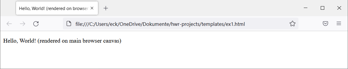
But - and this is the beauty of HTML - you don’t need to use all these different elements. A minimal HTML page that fully complies with the standard looks like this:
<!doctype html>
<html lang=en>
    <head>
        <title>Hello, World! (rendered on browser toolbar)</title>
    </head>
    <body>
        <p>Hello, World! (rendered on main browser canvas)</p>
    </body>
</html>
Let’s unpack this HTML page:
<!doctype html>is a void element for metadata: it tells the browser that a HTML document is about to follow.- Between the
<html>...</html>start tag and end tag, all HTML-type content is placed. This is called the root element.- Note: The concept of a root element has its roots in a standard called XML, to which HTML largely adheres.
- Only two direct child elements are allowed to the root element:
<head>and<body>. - Note how we gave
<html>thelangattribute, which we did to be 100% standards compliant (in practice often omitted).
- The
<head>...</head>element is a container for any document metadata.- Common metadata includes
<title>to define the document title (rendered on the browser toolbar by convention) and<link>to associate this HTML file to related resources like CSS files to be applied (more on that later).
- Common metadata includes
- The
<body>...</body>element wraps all content that the browser renders on its main canvas: this is the web page that the user interacts with.- In this example, the only content displayed is a text paragraph within the
<p>...</p>element. - At the end of a
<p>element, the browser automatically inserts a paragraph break (this behavior can be altered via CSS).
- In this example, the only content displayed is a text paragraph within the
The W3C standardization organization offers a popular validation service that checks your HTML for standard compliance. It is a very good idea to run your HTML through this validator, at least for your most important files (e.g., HTML templates that you want to use in Jinja2).
Even if your HTML does not conform to the standard, modern browsers will often render the page as you would expect: they have become pretty fault-tolerant and can handle many non-standard uses of HTML (e.g., if you forgot to close a HTML element with an end tag).
2.2. Commonly used HTML elements
Apart from <p>...</p>, here is a selection of the most commonly used HTML elements used within the <body>...</body> element (except for form elements, which are de-scoped from this notebook):
| Element | Description | Example |
|---|---|---|
<h1>...</h1>… <h6>...</h6> | Heading:<h1>: top-level section<h2>: subsection, etc. | <h1>FAQs</h1> |
<p>...</p> | Paragraph (a block of text or other thematic grouping) | <p>Here are some FAQs:</p> |
<a>...</a> | Link: the resource is the href attribute value, the displayed text is its content | <a href="faq.html">FAQ</a> |
<em>...</em> | Emphasize a particular string (commonly rendered with italics) | <p>This is <em>super</em> important</p> |
<span>...</span> | Similar to <em> but without semantic meaning | <p>Some <span>green</span> text</p> |
<ul><li>...</li>...</ul> | Unordered list with one or more list items (<ol> for ordered list) | <ul><li>Apple</li><li>Orange</li></ul> |
<img> | Image found at location src (note: void element) | <img src="faq.png"> |
<div>...</div> | Container that groups together related content | <div><h1>Title</h1><p>Text</p></div> |
In the HTML standard,
<div>is called “element of last resort” - its use is generally discouraged.But in practice, this element is very commonly used for layouting purposes, e.g., to denote a “left” section and a “right” section in a two-column page layout (actual layouting happens with CSS, but this already creates the proper structure in HTML).
With some CSS applied, it is completely possible to create a professional-grade web page with these elements alone. Having said that, you are more than encouraged to explore all HTML elements and use them as intended: this will increase semantics of your document, which yields many advantages such as better accessibility.
You may have noticed that form elements have been missing altogether in the table above. However, your typical web application will expect the user to input some data (e.g., to create a new user account or to provide log-in credentials).
Explaining form elements would be too much content for a single session, so here are two good resources for your to follow up with in your own pace:
2.3. The Document Object Model (DOM)
With HTML elements you structure a web page. Since elements can be nested, this structure is hierarchical. Let’s revisit the <body> part of our first example above:
<body>
    <header>
        <!-- header content -->
    </header>
    <main>
        <!-- main content -->
        <p>Hello, World! (rendered on main browser canvas)</p>
    </main>
    <footer>
        <!-- footer content -->
    </footer>
</body>
We can represent this structure as a hierarchical graph:
%%{init: {
  "theme": "neutral"
}}%%
flowchart TD
	body("<body>") --- header("<header>")
	body --- main("<main>")
	body --- footer("<footer>")
	main --- p("<p>")
This is a representation of this page’s Document Object Model (DOM):
- The
<body>element is a parent node to<header>,<main>,<footer>. - These elements are all called child nodes of
<body>. - Finally,
<p>is a child node of<main>.
The browser parses the HTML file it receives to create a DOM, from which it then creates the visual rendering, or the web page we eventually see in the browser.
Crucially, each node is an object that can be interacted with programmatically, most notably with JavaScript. This comes in handy when we want to change the web page dynamically from within the client, i.e. without the need to request a complete HTML file from the server. For example, we could define some code that will create another <p> child node to <main>, e.g., after clicking on a button.
Manipulating the DOM is a key pillar of the famous AJAX programming concept, which we don’t discuss in this course, since it requires knowledge of JavaScript.
AJAX has laid the foundation for modern single-page applications, or web apps that exchange just data with the back-end, not HTML pages.
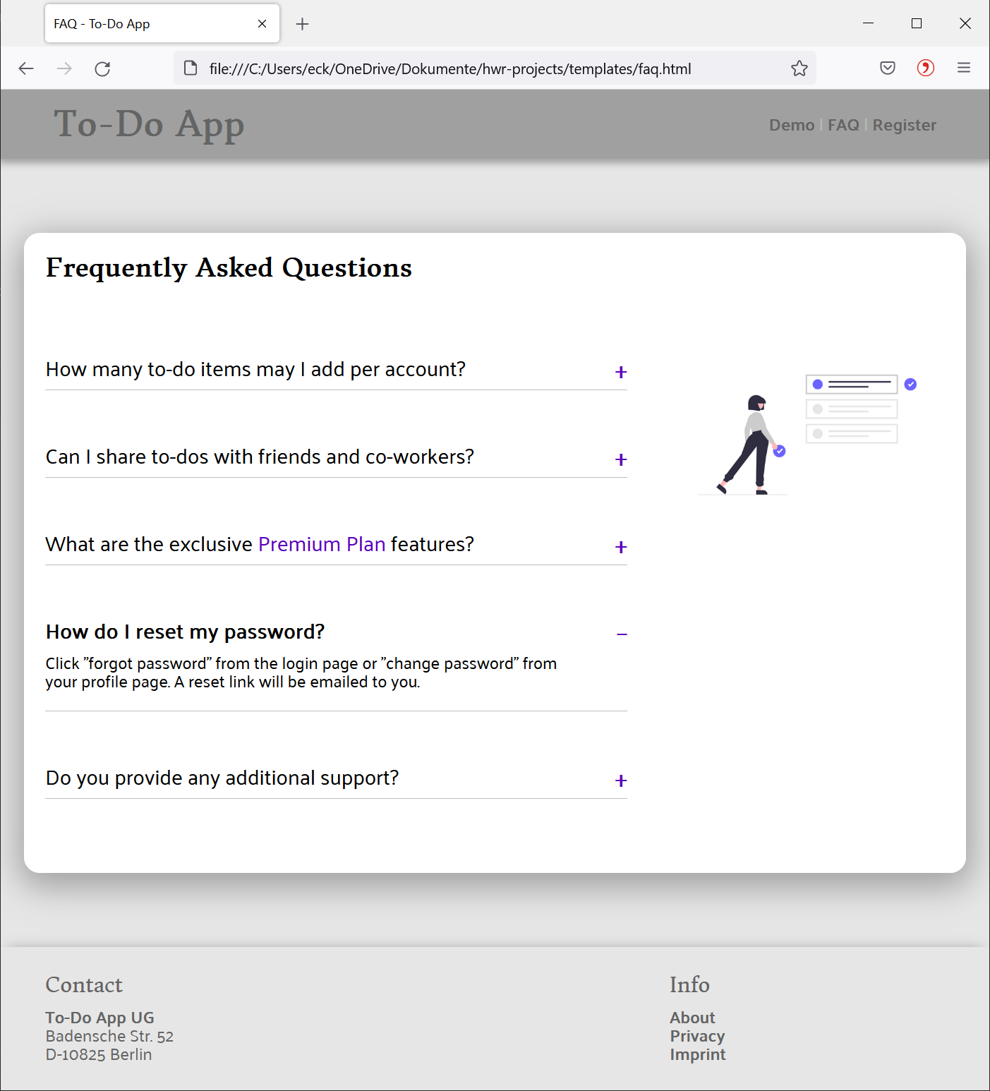
2.4. A complete example: FAQ web page
Loosely related to the to-do app example from previous notebooks, we want to create an FAQ web page. It shall contain:
- A header at the top of the page, which includes a title and navigation elements
- The main part with a section title, a list of all FAQs (the actual content) on the left-hand side, and an illustration on the right-hand side
- A footer at the bottom of the page, with some contact info (left) and other useful links (right)
This is the (slightly abbreviated) DOM tree we have in mind, starting with the <body> node:
%%{init: {
  "theme": "neutral"
}}%%
flowchart TD
	body("<body>") --- header("<header>")
	body --- main("<main>")
	body --- footer("<footer>")

	header --- h1("<h1>")
	header --- nav("<nav>")
	nav --- a_1("<a>")
	nav --- a_.("...")
	nav --- a_N("<a>")

	main --- h2("<h2>")
	main --- div_left("<div class=''left''>")
	div_left --- div_faq_1("<div class=''faq''>")
	div_faq_1 --- h3_1("<h3>")
	div_faq_1 --- div_1("<div>")
	div_left --- div_faq_.("...")
	div_left --- div_faq_N("<div class=''faq''>")
	div_faq_N --- h3_N("<h3>")
	div_faq_N --- div_N("<div>")
	main --- div_right("<div class=''right''>")
	div_right --- img("<img>")

	footer --- div_left_f("<div class=''left''>")
	div_left_f --- h4_1("<h4>")
	div_left_f --- p_c("<p>")
	footer --- div_right_f("<div class=''right''>")
	div_right_f --- h4_2("<h4>")
	div_right_f --- ul("<ul>")
And here is the HTML file 📄faq.html:
<!doctype html>
<html lang=en>
    <head>
        <title>FAQ - To-Do App</title>
        <link rel="stylesheet"
            href="https://fonts.googleapis.com/css?family=Donegal+One|Palanquin">
        <link rel="stylesheet" href="../static/css/reset.css">
        <link rel="stylesheet" href="../static/css/colors.css">
        <link rel="stylesheet" href="../static/css/style_faq.css">
    </head>
    <body>
        <header>
        <h1>To-Do App</h1>
            <nav>
                <a href="#">Demo</a> |
                <a href="faq.html">FAQ</a> |
                <a href="#">Register</a>
            </nav>
        </header>
        <main>
            <h2>Frequently Asked Questions</h2>
            <div class="left">
                <div class="faq">
                    <input type="checkbox"><span></span>
                    <h3>How many to-do items may I add per account?</h3>
                    <div>
                        <p>You can add an unlimited number of to-dos.</p>
                    </div>
                </div>
                <div class="faq">
                    <input type="checkbox"><span></span>
                    <h3>Can I share to-dos with friends and co-workers?</h3>
                    <div>
                        <p>Yes, you can share any to-do with other people.</p>
                    </div>
                </div>
                <div class="faq">
                    <input type="checkbox"><span></span>
                    <h3>What are the exclusive <em>Premium Plan</em> features?</h3>
                    <div>
                        <ul>
                            <li>Set reminders, with optional phone alerts</li>
                            <li>Organize to-dos in multiple lists</li>
                            <li>Seamless integration with ChatGPT</li>
                        </ul>
                    </div>
                </div>
                <div class="faq">
                    <input type="checkbox"><span></span>
                    <h3>How do I reset my password?</h3>
                    <div>
                        <p>Click "forgot password" from the login page.</p>
                    </div>
                </div>
                <div class="faq">
                    <input type="checkbox"><span></span>
                    <h3>Do you provide any additional support?</h3>
                    <div>
                        <p>Email support is available on best effort basis.</p>
                    </div>
                </div>
            </div>
            <div class="right">
                <img src="../static/images/undraw-to-do.png" alt="to-do image">
            </div>
        </main>
        <footer>
            <div class="container">
                <div class="left">
                    <h4>Contact</h4>
                    <p id="company">To-Do App UG</p>
                    <p>Badensche Str. 52<br>
                        D-10825 Berlin</p>
                </div>
                <div class="right">
                    <h4>Info</h4>
                    <ul>
                        <li><a href="#">About</a></li>
                        <li><a href="#">Privacy</a></li>
                        <li><a href="#">Imprint</a></li>
                    </ul>
                </div>
            </div>
        </footer>
    </body>
</html>
The
<link>elements reference the various files with CSS rules which we still need to write. In general, CSS rules can be applied in three different ways to HTML:
- Referenced from a dedicated external file (by convention with extension
.css). The link between CSS file and HTML is established with a<link>HTML element in the<head>section of a HTML file.- Embedded to the target HTML page, inside the dedicated
<style>HTML element, which is a child element to<head>(i.e., it is considered metadata).- Directly within a HTML element via attribute
styleas part of that element’s start tag.The introductory “Hello, World” CSS example further down uses the second method. To follow up with this topic, head over to MDN.
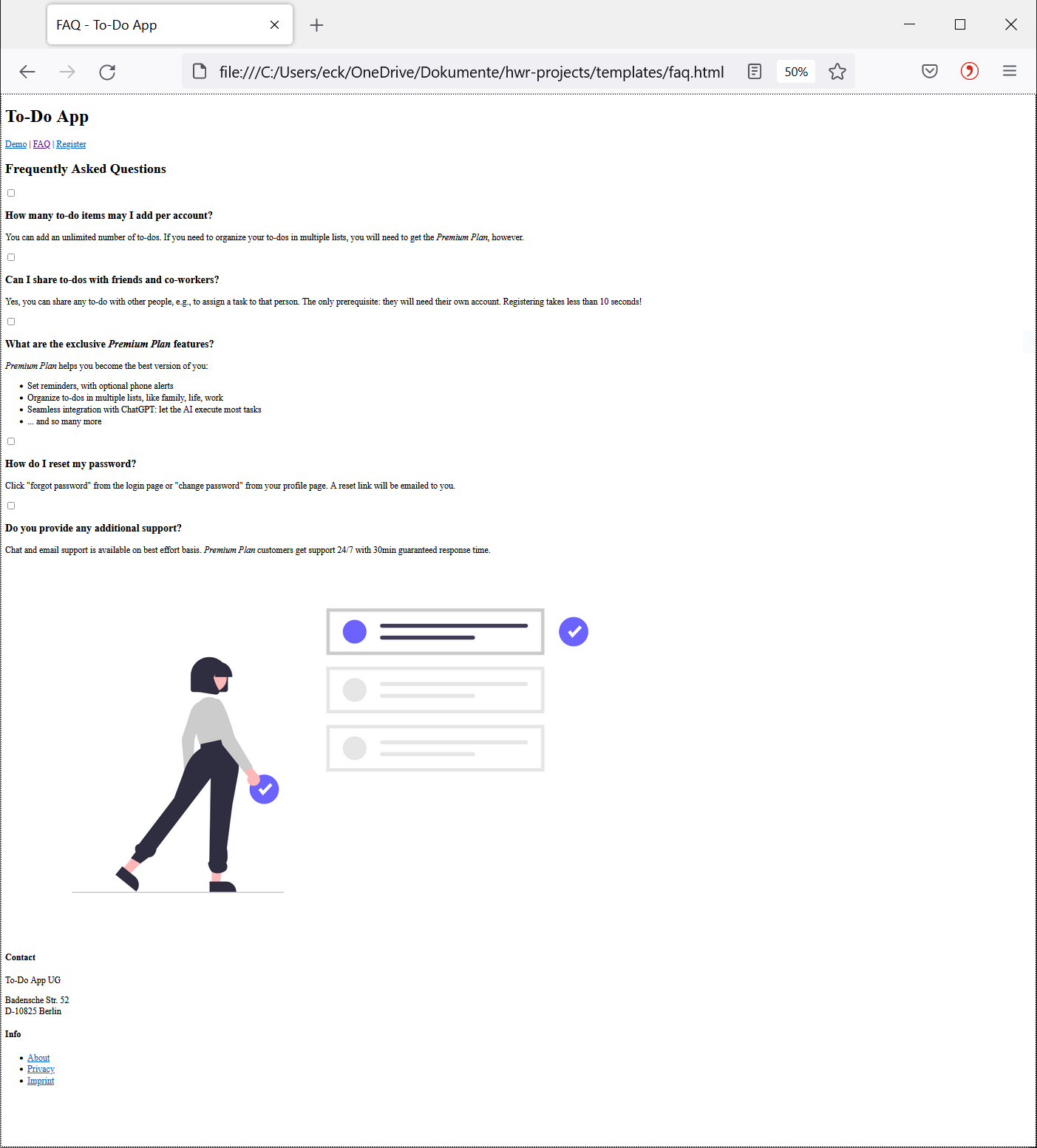
This is a rendering of the HTML file, without any CSS styling applied:
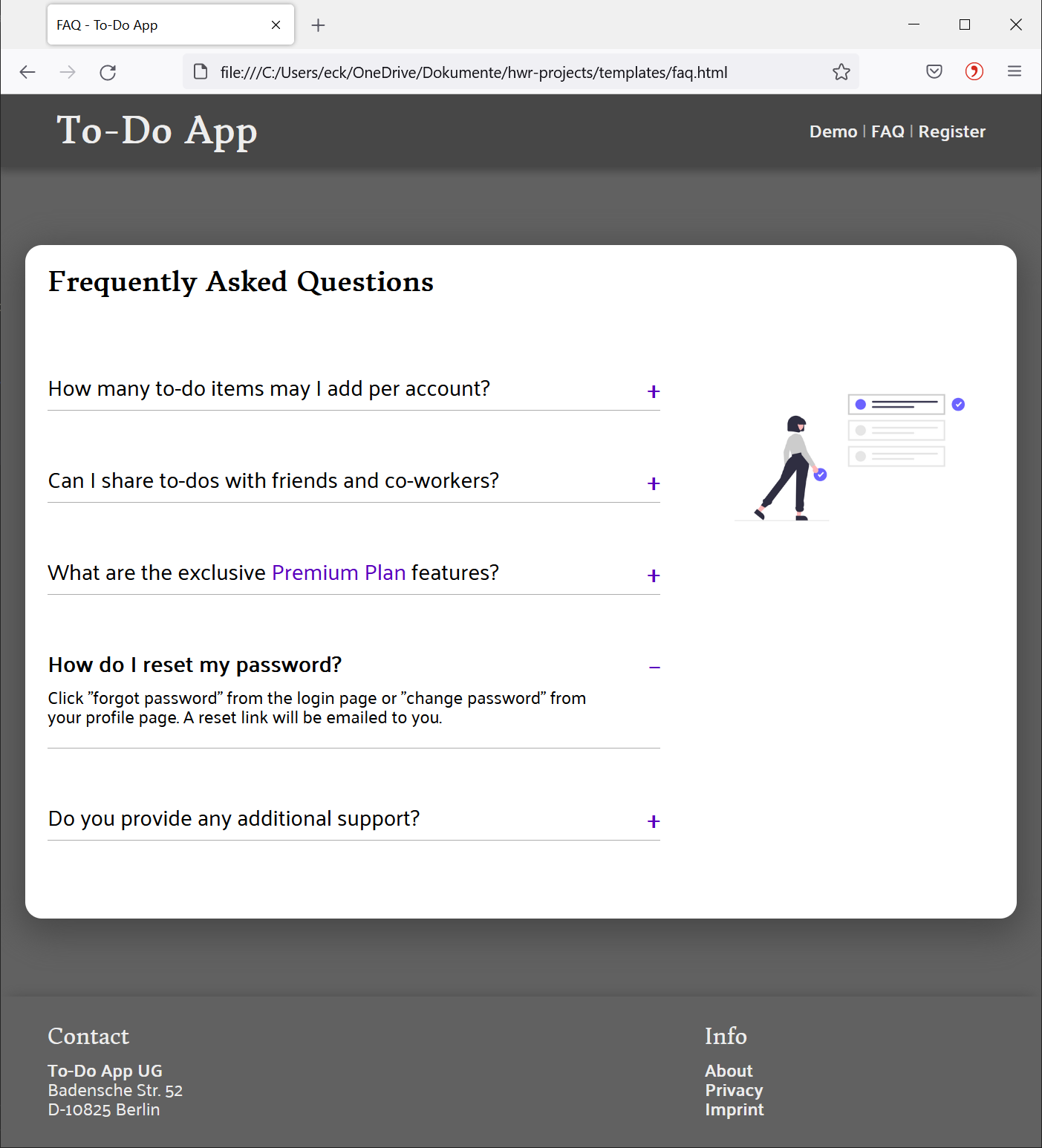
This page looks a bit messy and bland, so let’s style it with CSS to look something like this:
3. CSS
With CSS, we define the visual rules by which HTML elements shall be rendered by the browser. Any CSS rule is valid for a specific scope, e.g., a particular HTML element. For example, we may:
- Set a background color for the
<body>element; - Define font color of all
<p>elements; - Set rounded borders around our
<main>element; - Make the FAQ items (elements
<div class="faq-element">) collapsible, i.e. a click on the question shall reveal the answer text; - … and really anything you can think of visually.
This is the structure of a CSS rule:
\[\color{lightgray}\overbrace{\overbrace{\color{red}\textit{p.text}}^{\color{red}\text{selector}}\ \overbrace{\color{black}\{\color{lightgray}\underbrace{\color{orange}\textit{color}\color{black}: \color{teal}\textit{red}\color{black};}_{\color{brown}\text{declaration}}\ \ \underbrace{\color{orange}\textit{text-align}\color{black}: \color{teal}\textit{center}\color{black};}_{\color{orange}\text{property}\color{black}: \color{teal}\text{property value};}\color{black}\}}^{\color{black}\text{declaration block}}}^{\color{blue}\text{rule}}\]- A rule consists of a selector and a declaration block.
- The selector defines the scope to which the following declaration block shall be applied.
- In our example, we select a
<p>element with attributeclassset totext, i.e. we want to select all elements<p class="text">. - We will take a look at the selector syntax in a minute.
- In our example, we select a
- The declaration block is enclosed by curly braces
{ }and contains one or more declarations separated by semicolon;.- Per declaration we style a specific aspect: in the example above, the first declaration sets the paragraph text color to
red, and the second declaration horizontally aligns the paragraph to the page center.
- Per declaration we style a specific aspect: in the example above, the first declaration sets the paragraph text color to
- A declaration consists of a property and a property value.
- CSS has grown to contain well over 200 different properties.
- Depending on the property, its value might be a keyword (e.g.,
center), a number with/ without dimension (e.g.,800px), a percentage (e.g.,80%), a color as hexadecimal value (e.g.,#D50C2F) or RGB value (e.g.,rgb(213, 12, 47)), the return value of a function (e.g.,transform(-50%, -50%)), multiple values at once (e.g.,1px solid black), and a few other possibilities.
CSS lets us define our own custom properties, commonly called variables. It is useful to define variables whenever we want to reuse a particular value multiple times, e.g., a specific color code.
- Define a variable with the
--notation, such as:--color-shadow: rgb(71, 71, 71);- Then access it as property value via
var(), e.g.:border-color: var(--color-shadow);The example at the end of this notebook uses this feature to define a color palette and widths of the two-column grid layout.
CSS has significantly more complicated syntax and semantics than HTML. This is evident in the CSS standards documentation, which spans across multiple documents.
As typical developer, you don’t want to study the standard, but rather consult developer-friendly resources like MDN (see end of this notebook for more recommendations).
The selectors and properties chosen in this notebook are some of the more commonly used ones. Yet, you will likely need to research additional ones to realize your specific visual ideas.
3.1. “Hello, World” example
Suppose we want to style the “Hello, World” page from above:
We want to:
- set the background color to a light red,
- define the text color to solid red,
- horizontally align the text to the center:
<!doctype html>
<html lang=en>
    <head>
        <!-- CSS starts here -->
        <style>
            body{background-color:rgb(255, 200, 210);}
            p.text{color:red; text-align:center;}
        </style>
        <!-- CSS ends here -->
        <title>Hello, World! (rendered on browser toolbar)</title>
    </head>
    <body>
        <p class="text">Hello, World! (rendered on main browser canvas)</p>
    </body>
</html>
This yields the following result:
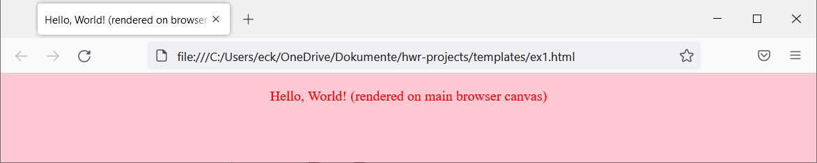
As you can see, we defined two CSS rules:
- The first one applies to the
<body>element and changes the background color. - The second rule applies to all
<p>elements withclassattribute set totext. In our example, there is just one such HTML element.
The W3C standardization organization offers a CSS validation service, just in case you were wondering.
Having said that, simply validating the syntax for correctness will often not help you to understand why something won’t render as you think it should render with the CSS you wrote. Here, the rather complicated semantics of CSS come into play. There are two essential tools that you should use regularly:
- The browser developer tools, which let you investigate and manipulate CSS directly on the web page in an interactive fashion.
- The CSSLint service, which suggests potential improvements to your CSS.
3.2. The “cascading” concept in CSS
Due to the structure of this particular HTML page, we achieve the same result by applying all rules to the <body> element alone:
<!doctype html>
<html lang=en>
    <head>
        <!-- CSS starts here -->
        <style>
            body{background-color:rgb(255, 200, 210); color:red; text-align:center;}
        </style>
        <!-- CSS ends here -->
        <title>Hello, World! (rendered on browser toolbar)</title>
    </head>
    <body>
        <p class="text">Hello, World! (rendered on main browser canvas)</p>
    </body>
</html>
The result is identical:
How can this be? This is why CSS has “cascading” in name:
- Many declarations are inherited by all descendants: a font size defined for
<body>will be applied to its descendants (e.g.,<p>elements within the<body>), unless overridden by another declaration specific for that element. This is why the DOM concept is so important to understand. - Furthermore, declarations can be overridden: for example, if we write
color:redfirst, and someplace latercolor:black, thecolorproperty will be set toblack. - Also, more specific rules have precedence, irrespective of the order in which they were written. Suppose we have a rule
p.text{color:red;}and later in our CSS we define the more general rulep{color:blue}. Any HTML element<p class="text">will have its text rendered in red - the more specific property value is not overridden by the more general one.
The CSS cascading algorithm takes many more factors in consideration - as with anything CSS, such subtleties will cause you some trouble at times.
Modern browsers come with their own default rules, e.g., to render a
<h1>element larger than a<h2>element by default - which may interfere with your visual ideas.Some developers don’t like these default rules, so they always start with Reset CSS rules to get a blank sheet. This is a controversial practice, since it doesn’t necessarily help with accessibility and definitely costs some performance. (The last example on this notebook applies a
📄reset.cssjust to show you how it’s done.)
3.3. Applying a layout grid
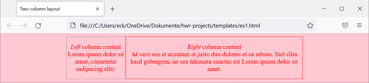
To extend the previous example, we now create a two-column layout grid:
- Overall content width:
600px - Left column width:
148px(plus a1px dashed blackborder around for a total of 150px width) - Right column width:
448px(plus a1px solid redborder around for a total of 450px width)
This grid example is a basic one. Any production-grade grid layout will leverage the native grid features of the CSS standard.
This is the DOM (again, just an excerpt with <body> element and all its descendants):
%%{init: {
  "theme": "neutral"
}}%%
flowchart TD
	body("<body>") --- main("<main>")
	main --- div_l("<div class=''left''>")
	main --- div_r("<div class=''right''>")
	div_l --- p_l("<p>")
	div_r --- p_r("<p>")
And here is the HTML with CSS styling:
<!doctype html>
<html lang=en>
    <head>
        <title>Two-column layout</title>
        <style>
            body{background-color:rgb(255, 200, 210); color:red; text-align:center;}
            main{margin:auto; width:600px;}
            div.left{float:left; width:148px; border: 1px dashed black;}
            div.right{float:right; width:448px; border: 1px solid red;}
        </style>
    </head>
    <body>
        <main>
            <div class="left">
                <p><em>Left</em> column content<br>
                    Lorem ipsum dolor sit amet, consetetur sadipscing elitr.</p>
            </div>
            <div class="right">
                <p><em>Right</em> column content<br>
                    At vero eos et accusam et justo duo dolores et ea rebum.
                    Stet clita kasd gubergren,
                    no sea takimata sanctus est Lorem ipsum dolor sit amet. </p>
            </div>
        </main>
    </body>
</html>
This is the result:
Let’s examine the CSS code:
- The first rule is the one from the previous “Hello, World” example.
- The second rules applies to any element
<main>(of which just one exists in our HTML).- By setting the
marginproperty to valueauto, we instruct to set this element’s margin area equally large left and right. This will center<main>horizontally. - In addition, we set the width to
600px.
- By setting the
- The third rule applies to any element
<div class="left">. - The fourth rule is structurally the same as the previous one, but with different values.
As this simple example already demonstrates, the art of CSS is combining its many building blocks cleverly. CSS is really like Lego bricks.
Unsurprisingly, there are CSS cookbooks with common recipes, articles on creative CSS solutions, and whole careers dedicated to mastering CSS.
Of course, there are also mature, long-lived CSS libraries with ready-to-use rules like Bootstrap and Tailwind CSS that many developers like using. (Note: some components of Bootstrap also leverage JavaScript.)
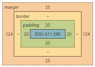
In case you were wondering, CSS has a bounding box concept consisting of
margin,border,padding, and the actualcontent(picture taken from the browser developer tools):
Read this article on MDN for a solid explanation of the bounding box concept.
It is worth mentioning that
margin,border,paddingproperties are not inherited from their ancestors. From our example above: the margin of<main>is not inherited by the<div>and<p>child elements.
3.4. CSS selector types
We have already used two selector types to set the scope of a declaration block:
- HTML element selector (e.g.,
bodyselects all<body>elements) - Class selector (e.g.,
div.leftselects all<div class="left">elements)
While the standard defines well over 60 different CSS selectors, for most use cases these selector types will be sufficient:
| Selector | Scopes the following | Example HTML element | Example selector |
|---|---|---|---|
E | HTML element of type “E” | <body> | body |
.c | HTML element with attribute class=c | <div class="left"> … <p class="left"> | .left |
E.c | HTML element of type “E” with attribute class=c | <div class="left>" | div.left |
#i | HTML element with attribute id=i | <p id="company"> | #company |
E F | HTML element of type “F” that is descendant of “E” | <p>...<em>...</em>...</p> | p em |
E ~ F | HTML element of type “F” that is preceded by “E” | <h3>...</h3><div>...</div> | h3 ~ div |
E, F, G | HTML element of either type “E”, “F”, “G” | <header> … <main> … <footer> | header, main, footer |
E[foo="bar"] | HTML element of type “E” with attribute “foo” set to “bar” | <input type="radio"> | input[type="radio"] |
E:hover | HTML element of type “E” that is under the cursor | <h3> | h3:hover |
E:checked | HTML element of type “E” that is checked (e.g., a checkbox) | <input type="radio"> | input:checked |
a:visited | HTML element of type “a” targeting an already visited link | <a href="b.com">Link</a> | a:visited |
E::before | Anonymous pseudo-element inserted right before “E” | <span> | span::before |
E::after | Anonymous pseudo-element inserted right after “E” | <span> | span::after |
:root | The root element, typically <html> (unless modified by scripting) | <html> | :root |
If this table looks overwhelming, don’t worry: with some practice, you will know when best to use which selector type. Just reading through this table is rather abstract, so you will need to find a CSS problem to apply this syntax.
You can combine CSS selector types arbitrarily. For example:
p.text emscopes any<em>element that is a descendant of<p class="text">, but not an<em>element that is a descendant of the more general<p>(withoutclassattribute).input[type="checkbox"]:checkedscopes any checked element of type<input type="checkbox">, but not a checked<input type="radio">.
3.5. A complete example: styling the FAQ web page
Finally we are ready to create the styled FAQ web page. In our HTML page, we reference three local CSS files and a remote resource:
<head>
    <title>FAQ - To-Do App</title>
    <link rel="stylesheet"
        href="https://fonts.googleapis.com/css?family=Donegal+One|Palanquin">
    <link rel="stylesheet" href="../static/css/reset.css">
    <link rel="stylesheet" href="../static/css/colors.css">
    <link rel="stylesheet" href="../static/css/style_faq.css">
</head>
From bottom to top:
📄style_faq.csscontains all rules to style the web page.📄colors.csscontains a custom color palette for coloring (which we could swap for a different color palette later on or via JavaScript, say with a file called📄colors_alt.css).📄reset.cssis the first CSS file to be called; it resets any default CSS rules set by the browser.- The first CSS file is sourced from the Google Fonts API. An API call returns specified fonts (in our example,
Donegal OneandPalanquin), which we can then use for styling. This is possible thanks to the web fonts capability of CSS.
I have included the Google Fonts API here mainly to motivate a strong word of caution: Whenever you use an external resource (i.e., make an API call to a web-accessible service), do your research beforehand.
The Google Fonts API is known to be problematic due to GDPR. After a ruling of Landgericht München in early 2022, German lawyers increasingly sent out warning letters - arguably to cash in on the fact that many developers and admins weren’t aware of these GDPR issues. Several prosecutors took action in response, for example Berlin public prosecutor. All this shows how a seemingly innocent API call can cause real troubles if not done purposefully.
It doesn’t make a lot of sense to explain the following CSS code. Since CSS is very visual, it is much more effective if you implement the example and play around with the various properties, property values, and selectors. For example, you could try out to see what happens if you:
- Delete
<link rel="stylesheet" href="../static/reset.css">- Delete
<link rel="stylesheet" href="https://fonts.googleapis.com ...>- Set different
font-size,line-height,color, … to play with text styling- Vary
--width-leftand--width-rightvariable values- Apply different
marginandpaddingto the various selectors- Get rid of all rules that apply to the
.faqclass
Styling with CSS has a lot to do with choosing the right color palette for your web application. For that, it is useful to learn the basics of color theory. Read through this article and this article to get started.
Without further ado, here is 📄style_faq.css:
:root {
  --width-left: 550px;
  --width-right: 260px;
  --width-container: calc(var(--width-left) + var(--width-right) + 40px);
}
body {
  background: var(--color-main);
  font-family: 'Palanquin', sans-serif;
  line-height: 1.1;
}
a {
  color: var(--color-highlight);
  text-decoration: none;
  font-weight: bold;
}
em {
  color: var(--color-accent2);
}
.container {
  margin: 0px auto;
  width: var(--width-container);
}
.left {
  float: left;
  width: var(--width-left);
}
.right {
  float: right;
  width: var(--width-right);
}
header, main, footer {
  overflow: auto;
}
header {
  background: var(--color-shadow);
  box-shadow: 0px 2px 6px 2px var(--color-shadow);
  margin-bottom: 70px;
  padding: 15px 50px;
  position: sticky;
  top: 0px;
  z-index: 100;
}
header h1 {
  color: var(--color-highlight);
  font-family: 'Donegal One', sans-serif;
  font-size: 2em;
  font-weight: bold;
  float: left;
}
header nav {
  color: var(--color-accent1);
  padding: 8px 0px;
  text-align: right;
}
main {
  background: white;
  width: var(--width-container);
  margin: 25px auto;
  padding: 20px;
  border-radius: 15px;
  box-shadow: 0px 8px 30px 5px var(--color-shadow);
}
main h2 {
  font-family: 'Donegal One', sans-serif;
  font-size: 1.5em;
  font-weight: bold;
  margin-bottom: 20px;
}
main .right img {
  margin-top: 50px;
  width: var(--width-right);
}
footer {
  margin-top: 70px;
  padding: 15px 0px;
  box-shadow: 0px -6px 12px -8px var(--color-shadow);
  color: var(--color-highlight);
}
footer h4 {
  font-family: 'Donegal One', sans-serif;
  font-size: 1.2em;
  color: var(--color-highlight);
  margin: 10px 0px 10px 0px;
}
#company {
  font-weight: bolder;
}
footer li {
  list-style: none;
}
.faq {
  position: relative;
  margin: 50px 0px;
  padding-bottom: 10px;
  border-bottom: 1px solid var(--color-accent1);
}
.faq input {
  display: inline-block;
  position:absolute;
  width: 100%;
  cursor: pointer;
  opacity: 0;
  z-index: 10;
}
.faq span::after {
  display: inline-block;
  position:absolute;
  right: 0px;
  content: "\002B";  /* plus sign (+) character */
  font-size: 1.35em;
  font-weight: bolder;
  color: var(--color-accent2);
}
.faq input:checked ~ span::after {
  content: "\2212";  /* minus sign (+) character */
}
.faq h3 {
  width: 90%;
  font-size: 1.25em;
}
.faq input:hover ~ h3 {
  color: var(--color-accent2);
}
.faq input:checked ~ h3 {
  font-weight: bold;
}
.faq div {
  display: none;
}
.faq input:checked ~ div {
  display: block;
  margin: 10px 0px;
  width: 90%;
}
.faq ul {
  list-style-type: "\1F44D";  /* thumbs up (👍) character */
  padding-left: 20px;
}
Here is 📄colors.css:
:root {
  --color-main: rgb(97, 97, 97);
  --color-shadow: rgb(71, 71, 71);
  --color-highlight: rgb(237, 237, 237);
  --color-accent1: rgb(173, 173, 173);
  --color-accent2: rgb(90, 0, 190);
}
And this is the alternative color palette of 📄colors_alt.css:
:root {
  --color-main: rgb(230, 230, 230);
  --color-shadow: rgb(160, 160, 160);
  --color-highlight: rgb(100, 100, 100);
  --color-accent1: rgb(190, 190, 190);
  --color-accent2: rgb(90, 0, 190);
}
…which yields the following alternatively colored web page:
For completeness, this is 📄reset.css created by Eric Meyer:
/* http://meyerweb.com/eric/tools/css/reset/
   v2.0 | 20110126
   License: none (public domain)
*/
html, body, div, span, applet, object, iframe,
h1, h2, h3, h4, h5, h6, p, blockquote, pre,
a, abbr, acronym, address, big, cite, code,
del, dfn, em, img, ins, kbd, q, s, samp,
small, strike, strong, sub, sup, tt, var,
b, u, i, center,
dl, dt, dd, ol, ul, li,
fieldset, form, label, legend,
table, caption, tbody, tfoot, thead, tr, th, td,
article, aside, canvas, details, embed,
figure, figcaption, footer, header, hgroup,
menu, nav, output, ruby, section, summary,
time, mark, audio, video {
  margin: 0;
  padding: 0;
  border: 0;
  font-size: 100%;
  font: inherit;
  vertical-align: baseline;
}
/* HTML5 display-role reset for older browsers */
article, aside, details, figcaption, figure,
footer, header, hgroup, menu, nav, section {
  display: block;
}
body {
  line-height: 1;
}
ol, ul {
  list-style: none;
}
blockquote, q {
  quotes: none;
}
blockquote:before, blockquote:after,
q:before, q:after {
  content: '';
  content: none;
}
table {
  border-collapse: collapse;
  border-spacing: 0;
}
Annex: Follow-up recommendations
Congratulations, you have made it to the end of this notebook! Going into this lesson, you might have thought that HTML is the complicated part, since CSS are “just” visuals.
It is likely that your perception has turned completely by now, for good reason: CSS is a very capable, but also rather complicated technology. For one, with 60+ selector types and 200+ properties, it has an extensive syntax. But it is really the semantics that make CSS difficult to master and at times hard to comprehend.
Luckily, there are many very good resources on both HTML and CSS for you to follow up with:
- SelfHTML: German only, but with several decades under its belt, arguably among the best resources found online to learn all about HTML and CSS.
- Quackit: similar concept to SelfHTML, but in English and with a lot of (annoying) advertisement on the pages. But the content is pretty solid - for example, the CSS reference is very exhaustive.
- HTML Guide and CSS Guide from MDN: quite a lot of explanations and background information, but well worth the time invest. MDN is also a great resource for reference documentation.
- HTML Tutorial and CSS Tutorial from W3Schools: more straightforward than the MDN guides, since the tutorials are centered around small examples with code snippets - a middle ground between learning material and reference documentation.
- Official HTML standard: mostly interesting for developers of web browsers, which need to implement the HTML standard. But at times, it is helpful to refer to this resource also as web application developer.
- Official CSS standard: as typical web developer, you want to consult the set of CSS standards (yes, there are many documents) just rarely, if ever - for example if you want to memorize cascading order. Usually, you are better off looking for the information you need on the pages linked above.
Copyright © 2026 Prof. Dr. Alexander Eck. All rights reserved.